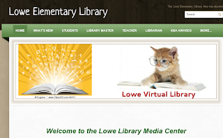
One website that I particularly liked was The Lowe Elementary Library. Here are a few things that I enjoyed about this site:
- The website is well-organized. I liked that there was a section for the students. They would know where to go to find the tools that they need for their research. There is also a section for the things that the librarian has taught throughout the school year.
- I thought it was a good idea to highlight the things that the school has done to promote reading. There are also links to the Summer Reading Challenge to get students excited about reading.
- There is an avatar on the home page that has an animated voice. Using a Voki avatar is something we've just learned about in our class.
Another website that I liked was the Newbury Elementary School Library Media Center. The more I explored these sites the more evident it became that most librarians present their sites in an organized and easy to follow manner. Here are some highlights:
- I loved how the librarian used a photo of the READ banner that is hanging in the library. It is an inviting way to showcase the library and the website.
- There are many links to popular authors' websites. Eric Carle, Robert Munsch, and Mo Willems are some of my favorites.
- I thought it was a good idea to mention books that are new to the library on the homepage. I think students are always interested in "What's new!"
- The webpage seems to be kept current. Summer reading lists are an appropriate thing to find on the website at this time of year.

I particularly like the Newbury site as it has a very clean yet utilitarian feel to it. There is an abundance of information to help the visitor, but one doesn't feel overwhelmed or distracted when clicking on the different pages. I really appreciate this with my students because so many of them can wander off the beaten path when visiting sites due to being distracted by a shiny object.
ReplyDeleteMy favorite is also the Newbury Elementary Website, although I love the information available via Lowe Elementary. Newbury has a cleaner format, and navigation in my opinion. I did not like how much scrolling was required for Lowe, however, this is due to recreating the website at our job this was one of the cons we put on our list. We realized most users wanted to be able to see the most important or needed information without scrolling. Thanks for sharing these sites, I only viewed Secondary websites. This will give me a broader perspective.
ReplyDelete